 Color Classification of a
GIS Map
Color Classification of a
GIS MapSection 2 – Richter Magnitude
Today we’ll introduce earthquake Richter magnitude. I believe almost everybody
has heard of the Richter scale but only a few people know what it means.
Part 3 - How can I map the magnitude of the earthquakes?
Color Classification of a
GIS Map
One of the most powerful tools you have for mapping
your data is the ability to use colors to represent the
data according to your classification. This requires
careful thought on your part as you make choices in
how to display the data in order for your map to be
useful to other people.
For this example, we will color code the earthquake
data you added in the previous exercise.
Earthquakes magnitude:
Earthquakes magnitude is primarily measured on the Richter scale. It was
invented by Charles F. Richter in 1934. The Richter magnitude is calculated
from the amplitude (or height) of the largest seismic wave released by an
earthquake, no matter what type of wave was the strongest.
|
Richter Magnitude Scale |
||
|
Magnitude |
Number of earthquakes |
Typical intensity |
|
>8.0 |
0.1 - 0.2 |
XII |
|
7.4 - 8.0 |
4 |
XI |
|
7.0 - 7.3 |
15 |
X |
|
6.2 - 6.9 |
100 |
VIII - IX |
|
5.5 - 6.1 |
500 |
VII |
|
4.9 - 5.4 |
1,400 |
VI |
|
4.3 - 4.8 |
4,800 |
IV - V |
|
3.5 – 4.2 |
30,000 |
II - III |
|
2.0 – 3.4 |
800,000 |
I - II |
Table of Richter Magnitude Scale
Source: http://www.em.gov.bc.ca/Mining/Geolsurv/Surficial/quake/eq2.htm
1. First, right click on the “Quak2000.txt” layer and choose Properties from
the drop down menu.
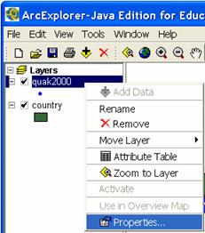
Choosing Layer Properties
2. Choose the Symbols tab.
3. Select Graduated Symbols from the Draw features using option menu and
Mag (Magnitude) from the Field option menu.
4.
When
you are finished, click ![]() .
.
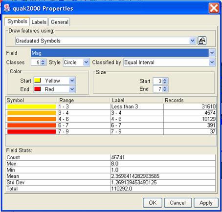
Classifying the Layer Data
You will choose to use graduated colors based on the magnitude of each individual
earthquake. Lighter colors will show earthquakes with a lower magnitude while
darker colors will show earthquakes with a higher magnitude. This way, instead of
just a bunch of dots with the same color, you will also be able to tell how strong
the earthquakes are on your GIS map.
Near the middle part of the dialog box, notice the Color choice. The color let you
select the shades of color used for graduated symbols. In many situations, a
particular color scheme is appropriate. For example, blue would be a good choice
to show cold weather on weather maps while green might be useful for vegetation
maps.
Try a different color by clicking on the Start and End option menus to choose
your own preferred colors.
Be sure to click ![]() to see the changes. When you
to see the changes. When you
are satisfied with the color, close the Properties dialog box by clicking on the
![]() button.
button.
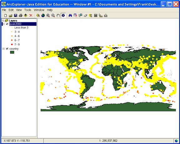
This map now shows the location of earthquakes in 2000, with the darker colors
representing the quakes with greater magnitudes:
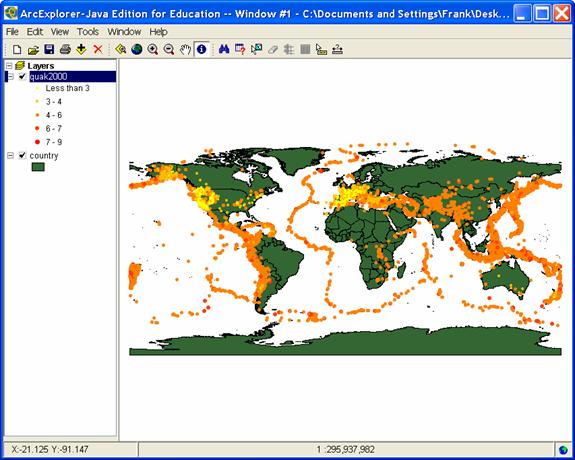
GIS Map Showing Location, Number, and Color-Classified Magnitude of Earthquakes
Notice that the lighter colors (representing lower-magnitude quakes) tend to be
clustered around the western part of the United States and in Europe. Much of
the science of seismology and plate tectonics involves noticing and investigating
spatial patterns like this. Your GIS map made these observations possible. See
how powerful of a tool GIS can be!
Now, we’ll use the ArcExplorer to investigate the locations of the “smaller” quakes.
1. First, we need to “thin out” the quake data set to show only the smaller
quakes. We are sort of trying to ignore the rest of them.
Note: To show only part of a layer, first make sure it is the “active layer”
(the “active layer” appears “raised up” in the list of layers on the left of
your ArcExplorer window). Make sure the “quak2000” layer is “active” by
clicking on the layer name once.
2.
Select
the Query Builder ![]() tool from the Tool Bar.
tool from the Tool Bar.
We will use the Query Builder to display only those quakes with a magnitude
of between 3.5 and 4.2. That is because in the Richter Magnitude Scale in
the table above, magnitudes of 3.5-4.2 represent the typical intensity at
an epicenter II – III.
3. In the Query Builder dialog box, double click on the field [Mag].
4.
Click
once on the Greater Than Or Equal To button ![]() .
.
5. Type in the number 3.5.
6.
Click ![]() in the Query
Builder.
in the Query
Builder.
7. Double click on the field [Mag].
8.
Click
once on the Less Than Or Equal To button ![]() .
.
9. Type in the number 4.2.
10. Click ![]() to execute your
selection.
to execute your
selection.
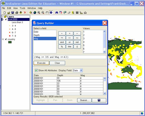
Query Builder Used to Sub-Select Data
Your map now shows only the locations of recorded earthquakes with a magnitude
of between 3.5 and 4.2. All of the other data are ignored for now and not selected.
GIS Map Showing Results of a Sub-Selection Query
It might be interesting to
zoom in on an area using the Zoom In ![]() or Zoom Out
or Zoom Out ![]() tools.
tools.
Go ahead and try.
Remember, you can return to the “Full Extent” of the entire world map by
clicking on the Zoom to Full
Extent button ![]() . This allows you to see
. This allows you to see
everything on the entire map after you have zoomed in or out.
Do you recognize the area shown in the following map?
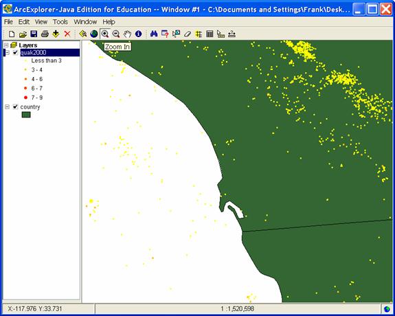
Zoomed in Display of GIS Map Showing Individual Earthquakes
Woops! Looks like we ran out of time again. I need to say goodbye here.
Next time, if you watch TV or listen to the radio with you family or friends and
hear something about earthquakes, you can explain earthquake magnitude and
the Richter scale to them. They will probably be so impressed after hearing
your explanation that they will call you Dr. Earthquake.